 Portal
Welcome to Toon World Academy, please register here or login.
Make sure to read the starter guide and rules before posting.
If you have any questions ask them in the chatbox or PM one of the staff members.
Toon World Academy
 Message [Page 1 of 1]
Re: Pain~ Mon Nov 12, 2012 7:38 pm

 Gender :
  Posts : 263 Re: Pain~ Mon Nov 12, 2012 8:03 pm
 Gender : Posts : 1056 Re: Pain~ Mon Nov 12, 2012 8:41 pm
 Gender : Posts : 728 Re: Pain~ Mon Nov 12, 2012 9:19 pm
 Gender : Posts : 1711
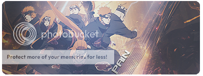
! ! ! ! REL1NQUISHED wrote:6/10
Too bright and it hurts my eyes looking through it back and forth.
Font could have been better. Render ain't too good either.
Re: Pain~ Tue Nov 13, 2012 4:14 am Gender : Posts : 354
Omega.exe wrote:Kinda saturated but i guess it is okay. Maybe it would look better with less of a greyish tint? IDK.
8/10
Re: Pain~ Tue Nov 13, 2012 6:30 am
 Gender : Posts : 2144
! ! ! ! REL1NQUISHED wrote:6/10
Too bright and it hurts my eyes looking through it back and forth.
Font could have been better. Render ain't too good either.
Re: Pain~ Tue Nov 13, 2012 7:38 am
 Gender : Posts : 1065
 Message [Page 1 of 1]
Permissions in this forum:
You cannot reply to topics in this forum
|
|
|
|
|
|
|
| Syrufit (2657) | ||||
| Fluffytots (2359) | ||||
| Maximillion Pegasus (2309) | ||||
| CryonixHeat (2144) | ||||
| Jimi (2131) | ||||
| Tempest (2008) | ||||
| MemorySP (1711) | ||||
| GaryRulez (1167) | ||||
| Lunatic (1116) | ||||
| Eheroduelist (1089) |

 Your profile
  Social
 Private messages
 Other
Other